Sunday 20 October 2013

Props

Props that we have chosen are relevant for both our narrative and performance. As we are using illustration many of the props are specifically chosen to accompany the narrative of our video. The instruments will be needed on both days, the other items will only be needed on the second day when we plan to film the narrative. (Mic, Electric guitar, Bass guitar, Drum kit, Games console, "Girly" films, vase, calculator and spaghetti - with pates etc.)


Games console - Nerd scene
Calculator - Nerd scene
Film - Punk scene
Spaghetti - Punk scene
Vase - Argument scene

Saturday 19 October 2013

Location 2

This location will be where we film the narrative to our music video. We decided that what fitted our narrative well would be for it to be as realistic as possible. Because of this decision we decided that we would film in a house, Ben's house, this provided us with the location for scenes between the nerd and female character, the punk and the female character and the lead and the female character. Scenes such as the nerd paling a games console with the female character and the lead having an argument with the female character are all feasible in the house setting. It also provided the opportunity for an outside location for the replication of the lady and the tramp scene, an outside patio/pergola.

All of the locations shown below were chosen as it again gives an element of reality to the fantasy scenes we will produce, a good contrast. The idea was for them to look like the average and typical house in which you would have a first date type occasion, because of this we were looking for something to match our narrative type more so than our genre of music, however our research has allowed us to combine some elements of our genre which can be seen in things like our costume.

The house from the outside


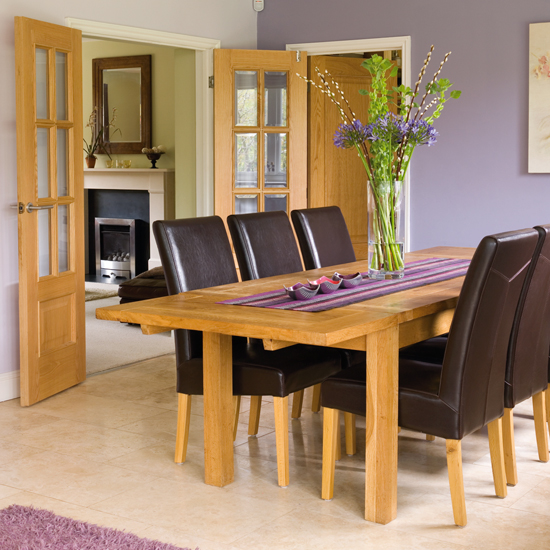
A dining room that we would use for the nerd "working" scene. (not actual one we will use)


A lounge that we would use for the nerd games scene and punk/thug romcom scene (again not actual)


The pergola that will be used for the outside "lady and the tramp scene"

Friday 18 October 2013

Location

Location - Tolethorpe hall - performance shots

When looking for a location we really wanted to use something that was unique but also gave a good feel and had conventional aspects to it. When looking for a location we decided that there would be nothing better than to use something that is designed for performance, and so we came across Tolethorpe hall. Tolethorpe hall is located just outside of Stamford and is equipped with rooms and stages designed for theatrical performances, e.g. Shakespeare. The stages would be ideal as they are designed to capture light and sound. When looking at the space we could use we decided that it has the correct look for a rock music video. The opportunities for good cinematography, such as high points and plenty of space to work with, will be extremely useful. It also has the opportunity to have consistent light that is effective.

The photo's below are of the outside stage that we may be able to use. They show the good lighting, due to the direction that it faces, and the vast amounts of space we could use. The setting also has many props and unique objects that we could include in the shots, such as the audience chairs and pieces of setting that are used for drama performances. This stage also gives a good balance between urban/infrastructure, with the building itself and the stage, and nature, the trees in the background and leaves that will most likely be scattered everywhere.

(the stage close up)
Seen in the background are a set of steps, these allow us to have a raised view, allowing some good high angles giving the video diversity. As a scale we did set up the drums, which look minuscule in this large space.

(the stage from the top of the seating area)
As seen in this picture the space we can use is huge! Because of the work being done on it, it also looks run down giving a slightly darker yet rock 'n' roll feel to it.


(the stage from the outside)

This shot just shows what it looks like form the outside and how it is located in the country side.


Another option that Tolethorpe provides is the orangery room. This again has loads of space that we could use and lots of windows providing light, roof windows as well as large windows on the walls. Hopefully we would be able to have access to both, however depending on the weather we may be only able to use the orangery room.


Thursday 17 October 2013

Costume

Costume

We selected three stereotyped groups and made our bassist a "Nerd", the guitarist "Camp" and our drummer "Punk". For each of these we are using our music video to play with the stereotypes that they have, therefore the costume that they wear has to be conventional to their stereotypes.

Nerd


Our nerd character will have to wear the typical smart or almost over smart look that many people associate with this group. The white shirt, bow tie, high trousers, glasses and braces are what we decided is the extremely stereotypical attire that the nerd would wear.


Camp

Our camp character again would have to follow the general stereotypes that this group of people are given. From research and our own opinions we decided bright colorful shirts (maybe with flowers on it), scarf and a cardigan would be suitable.
Neppy Shawl Collar Cardigan

Punk

The punk is also a group with an easily recognizable attire. We decided that a vest top, leather jacket, sunglasses, spiked hair and ripped jeans would fit the bill and follow the stereotype that they have.


Lead
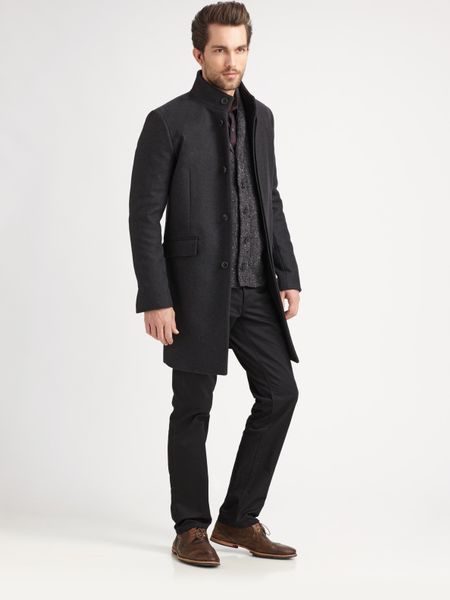
Our lead has to not follow a stereotype and will be dressed as normal as possible, but he still has to fit in with the rock genre. A long coat, t-shirt or shirt and jeans we feel would suit this role.


Tuesday 15 October 2013

Conventions of ancillary tasks - Album art


This is Bowling for soups 1985 album art work. This follows the conventional layout of the album art, this would be band name and text in big letters at the top, picture in the middle of either the band or the main concept that the band were going for and also features the albums name in big letters. Using this conventional layout and concepts that the majority of the rock genre bands use, we can use the same concepts to create ours. The idea of an optical illusion/ black and white pattern is something that we like and will probably use in the production of our digipack art work.

The colours in all three of these album covers are very conventional of the rock genre. The contrasting black and white are typical of the genre, almost punk like features of the album art again are extremely conventional. The blink 182 album featured to the left shows the typical layout of an album cover, band name, picture and album name in that order from the top to bottom. one feature that is very prominent is the font used, usually the band will have a font that they have chosen that will be featured throughout their entire career.


The sum 41 album cover again is almost identical in themes to the other two above, in terms of colours and "feel". Using the saturated black and white effect , and having the lead singer on the front cover, following the conventions of the rock genre album cover. This shows just how conventional many album covers are and would allow us to decide that choosing to do a conventional, black and white, band member pic and iconic font would be the best approach to creating an album cover for our chosen band "Scar".
This Digi pack format is something that we have put together using the conventions and what we have seen above. The black and white is something that we took into consideration however we decided to change this slightly for the sepia affect, we still however used black and white images, but just converted them. On one of the tiles, the front cover, you can see that we have used a picture of the band, the way they are standing and the mis en scene of the shot stays very traditional to the rock genre. Very similar to the sum 41 album cover shown above, this picture features the same stance form the lead of our band with the stance of the lead of sum 41, the urban setting is also again featured in both. The three bottom tiles are pictures, mainly of random urban settings, again still in sepia staying with the rock theme throughout. The top three tiles are patterns/optical illusions, the inspiration coming from the bowling for soup album cover, the checkered board being very similar to the bowling for soups background to their album cover. The circular optical illusion is something that was built up upon the idea of the black and white patterns, The fact that this is the area in which the CD would be kept and the optical illusion is circular fits nicely, but we liked the idea of an optical illusion as it creates this dynamic tile that not only looks good but also creates an idea of "movement"


Thursday 10 October 2013

Conventions of ancillary tasks - Posters/adverts


 This first poster or magazine article is for Blink 182's Neighbourhoods album. This band are in the same genre (rock) as our chosen unsigned band Scar and show a lot of similarities in song types, especially our chosen song "As long as you know". looking at the poster we can judge what the conventions of a rock genre poster are. The main picture is usually the album cover, but not always, in this case it is and therefore links the poster to the album instantly, in the cases of posters that don't have the album cover the picture or theme of the poster will be linked to a specific song or theme that the band have. The colouring of the poster is a contrasting black and white, black background, black and white art piece and white text to differentiate from the black background. The text is usually large and easily seen and usually is all in a font that the band use often and again will be featured on the album cover for the CD or digipack. Main information included is the title of the album, "the new album from" or " The debut album form", shows a specific song that is featured and the date on which it is released. (also record labels etc are usually shown at the very bottom and a website for info on the band).
 
 
 This second poster/ magazine articile is for Kasabian and their debut album "Kasabian". This band also follow in the rock genre however are also tied in with the indie genre, however similar ideas are used. Again much like the previous poster it features the album cover on the front in the centre. The colour scheme is again the contrasting colours of black and white, again black background, album cover in black as white as featured on the the CD or digipack available and white text to contrast against the background colour. The layout is slightly different, this time some text is at the top instead of all at the bottom, however the text is virtually exactly the same, "Featuring ..." etc.

looking at these posters we gain an idea of the basic layout and structure and common colour schemes and text that is included, research that will definitely influence our final product.


This is a promotional poster for Green days Uno, Dos,Tres tour. It is slightly diffferent to the others as it is promoting a tour and not an album, however similar concepts are used. Big text used to show the name of the band, this time colour is used with the green however the black and white appear again.The picure this timeis of the band, again this is conventional of rock music posters, many others use a band shot every now and then.

Pitch for idea no.2


Our second idea follows the more serious, illustrative route of the song. Using the lyrics we determined that the song is about a relationship and the fact that this one person cant be without the other. The idea itself is quite dark however this follows suit of most serious rock genre videos. Using the lyrics we would be playing on the idea  of being without this person that you "need" in your life, the other half of the relationship being described in the lyrics. To do this we would use the cliche first date concepts shown below, we would show the lead of the band with his girlfriend (the person he is singing about/to) on these first dates however using editing we Will create the effect that she disappears because she isn't really there with him although he will still carry on the activity he is doing but alone. Towards the end of the song and video we will show the real location of  his girlfriend and that will be in a hospital, in a bed, in a coma ... very dark and serious but would give the effect and illustration that we want to portrait.


Pitch for idea no.1